Episode 15 of my irregular photo journal - Why not colour?
Why not colour? I get this question fairly often. And I get it. The vast majority of my work is shot in monochromatic black and white. Am I colourblind? Am I lazy? Do I know how to even work with colour? No, no, and I think so. It is a stylistic choice for me that will hopefully make more sense to you at the end of this blog. And yes, I do spell it colour, not color. You know, the right way. Apologies to my American friends.
We are nearly coming up to a decade since I made the decision to abandon colour in my documentary photography. And there are a few reasons I did so. I have been photographing on and off for many years before that but I never really felt any personal touch developing during those years. I felt like I was just aimlessly wandering through photography with no real idea of what I was doing.
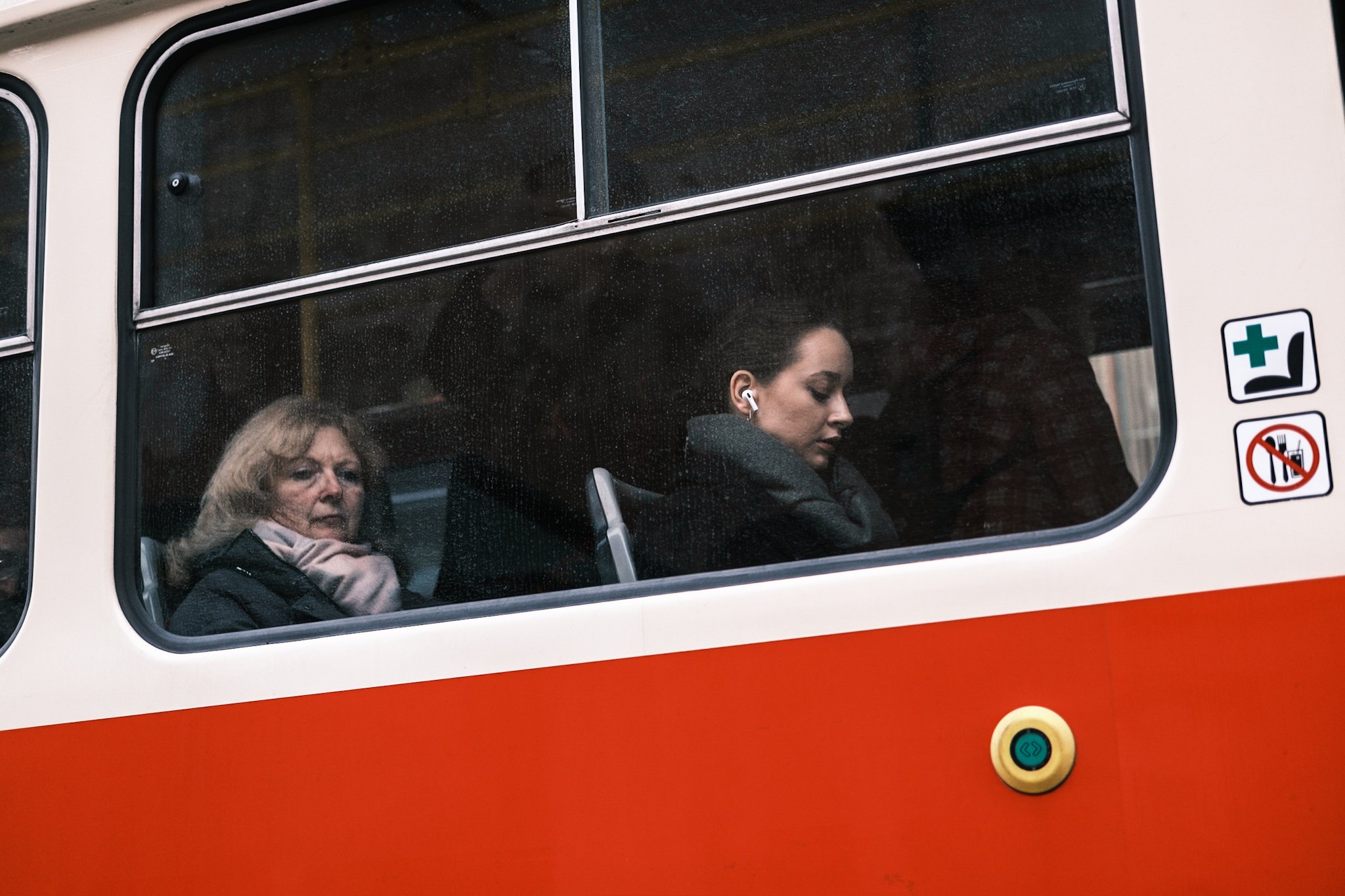
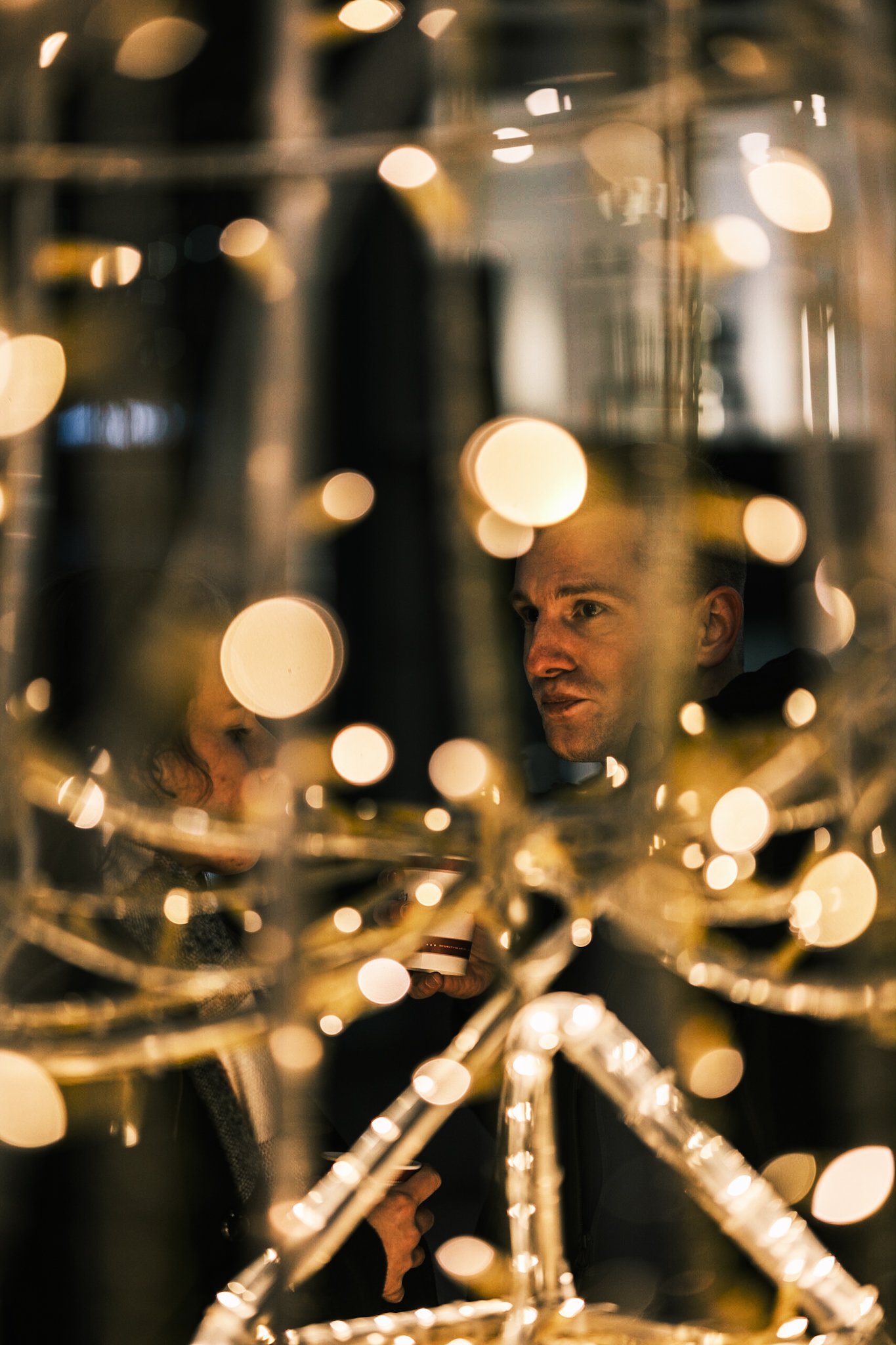
Then I read this quote by Ted Grant that I carried with me ever since. “When you photograph people in colour, you photograph their clothes. But when you photograph people in black and white, you photograph their souls.” It was around that time when I lost most interest in snapshotting postcard cityscapes, posed clicks, long exposures of buses passing by, and emotionless architecture compositions. I felt like I needed to capture more. I needed to freeze emotions in time for the future. An old building is most likely going to be standing a hundred years from now and it is going to get photographed from every angle possible by up-and-coming photographers. But a human interaction, a brief split second of emotion between lovers, strangers, commuters may never be seen again. The mundane of today is going to be incredibly interesting decades down the road. A cook on a smoke break outside of his pub may seem like a boring photo today, but fifty years from now it may well be the only record of that person’s boring ten minutes between orders. I have tried for years to fully explain why I feel the urge to photograph this but I can not. Candid and true moments just draw me in. And that is where monochromatic images shine in my humble opinion.

The why
Firstly it helps with composing. I often find colour distracting. With black and white you concentrate on where the light falls, or on its absence and that’s it. It simplifies the process. All that is needed is to work with the composition and disregard any disturbing elements or colours as long as they do not stand out in the composition. It is a perfect practice for a starting street or documentary photographer which I was back then.
Of course, you need to work with the correct moment, with the emotion of the scene, and with the overall feel. Just because the shot is black and white does not make it better than the colour one. It can often have the opposite effect. But when I shoot I am mostly 99% convinced the final edit of the image is going to be black and white and I’m working with that. Was I ever wrong when I did that? Of course! On multiple occasions. That is one of the main reasons I shoot RAW.
Because even though I shoot in black and white I still like the option to go back to colour if I need to. But I rarely do. You see, it took me a while but I found my style. I found what works for me and what gives me my desired outcome. High contrast gritty grainy black and white. I mostly do not care about noise or grain in my captures, I care about three things. Light, composition, and the captured moment. I have always said it is better to have a grainy image than not to have an image at all. And let’s be honest. Grainy black and white just looks better than grainy colour.
Another rather key point as to why shoot black and white is consistency. If I’m photographing a series of images, an event, a protest, or a wedding and ten out of a hundred final keepers look better in colour I’d still rather keep them black and white. The flow of the album just works better, there are no jarring jumps from colour to black and white, and it simply feels unified. The only time I was ever happy delivering images in colour was when the entire batch of photos was done in colour. Because, as I have said, the flow of a mix just doesn’t sit right with me. In these cases, I even resorted to delivering two separate albums. One in colour, which the client wanted and one in black and white, which I was happy with.
The how
When it comes to black and white photography you simply can’t just snap a picture and then desaturate it in post. I mean, it works, but you’re getting a boring shot at best. You need to think monochrome as you’re photographing. Mirrorless cameras make it much easier nowadays thanks to their electronic viewfinders. I can’t ever recall a time when my viewfinder projected a colour image to my eye. I’ve got my cameras set up in black and white permanently. It helps with concentrating on the light and the composition.
Not just that though. I love emulating a red filter in front of the lens. The majority of cameras can do so nowadays. A red filter makes skin tones pop in black and white whilst the skies and foliage darken. It is a perfect combination for capturing people. I don’t use it for all of my monochrome images but a vast majority do end up with a red filter simulation in the final edit. My go-to is Fujifilm’s Acros+R. But other brands can get similar results.
This can be done in post as well. For example, instead of just desaturating the image, convert it to black and white in lightroom or any editing software of your choice and then you can often play with the channel mixer. This way you can adjust the brightness of individual areas of the image based on what colour they have underneath the monochrome conversion. You can get some really dramatic and dark skies on a sunny day whilst keeping skin tones bright and making clouds pop. A good rule of thumb is to darken blues and greens whilst brightening reds and oranges.
Contrast, clarity, whites, blacks, shadows, highlights and curves are a whole different process compared to colour. I find it more forgiving if you decide on a more dramatic look. A super contrasty colour image feels off and unnatural, but do the same for a monochrome one and suddenly you’ve got an interesting dramatic shot.
When not to
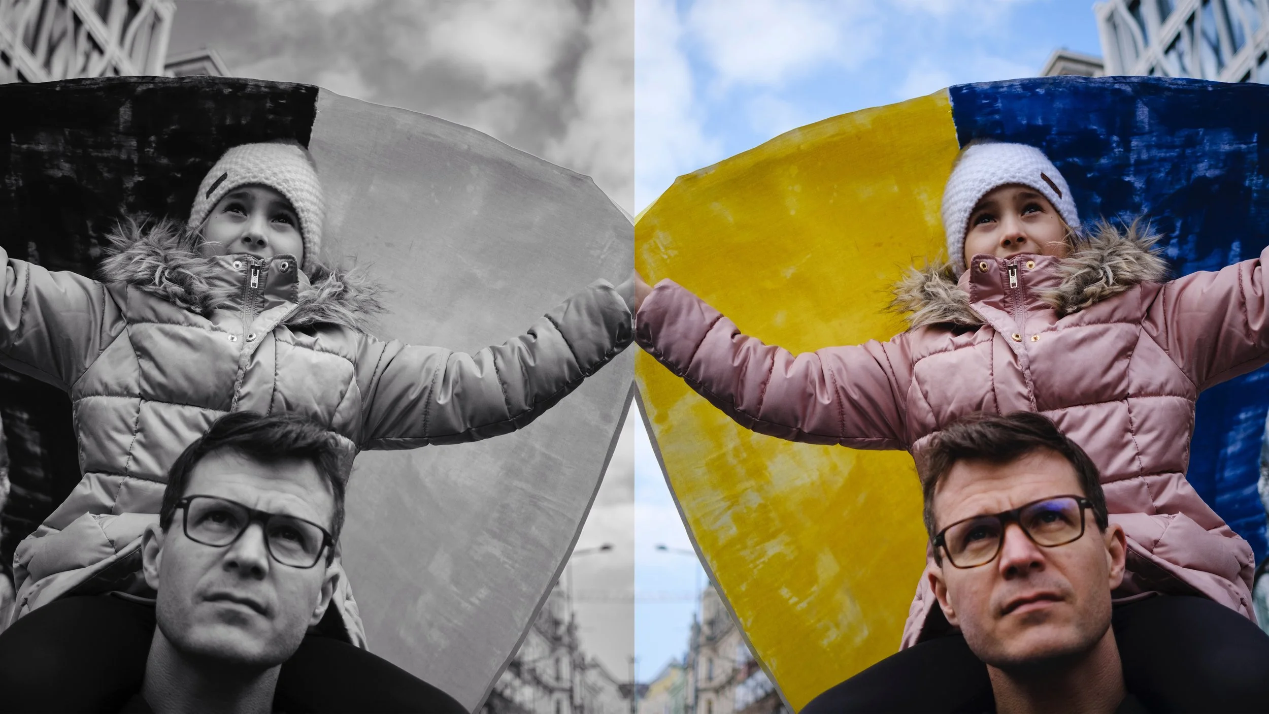
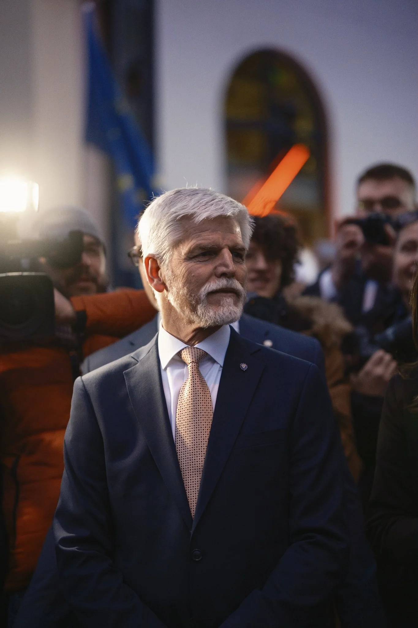
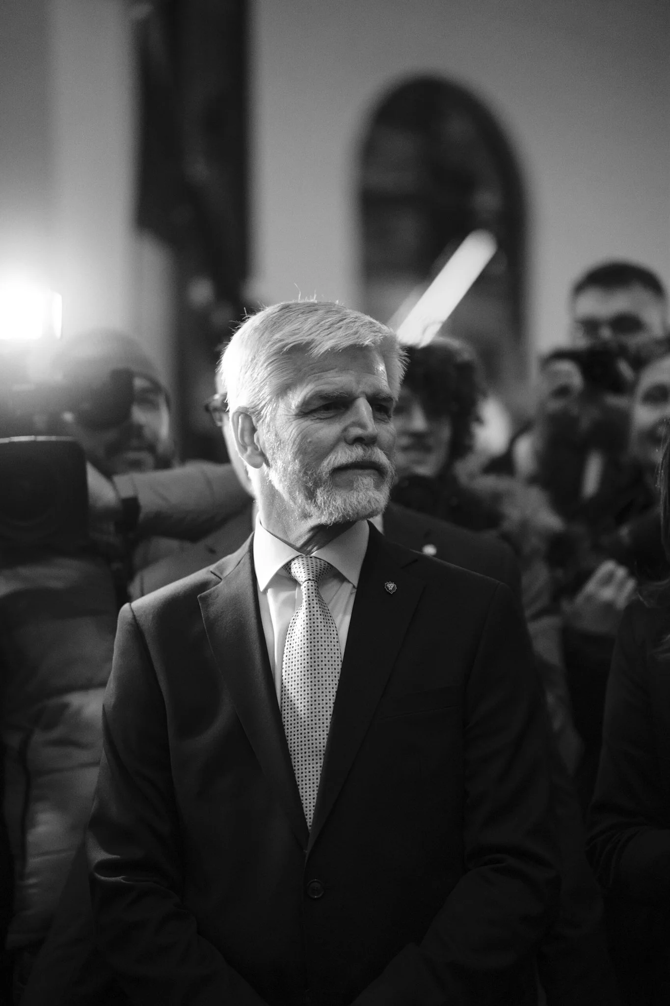
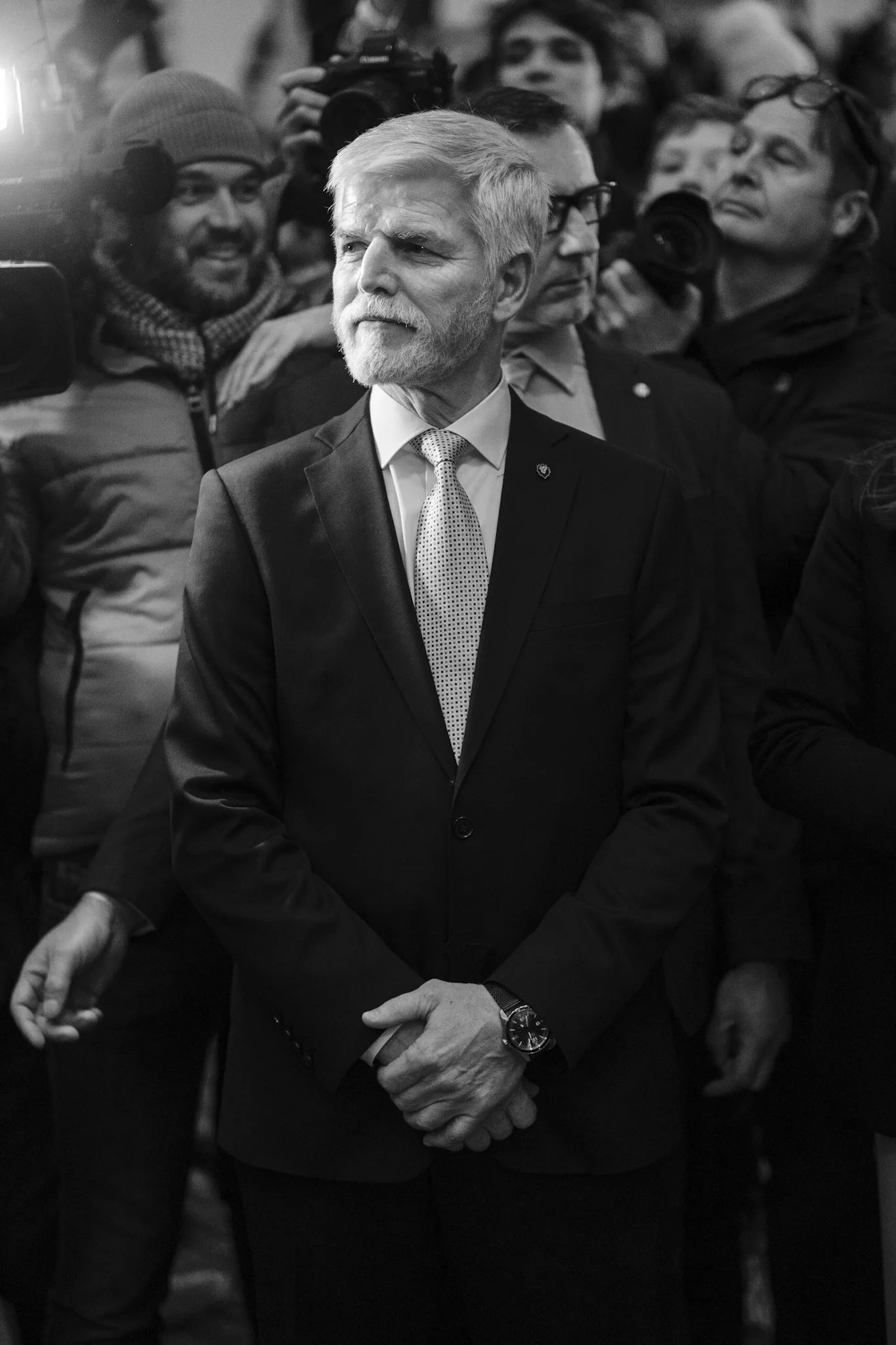
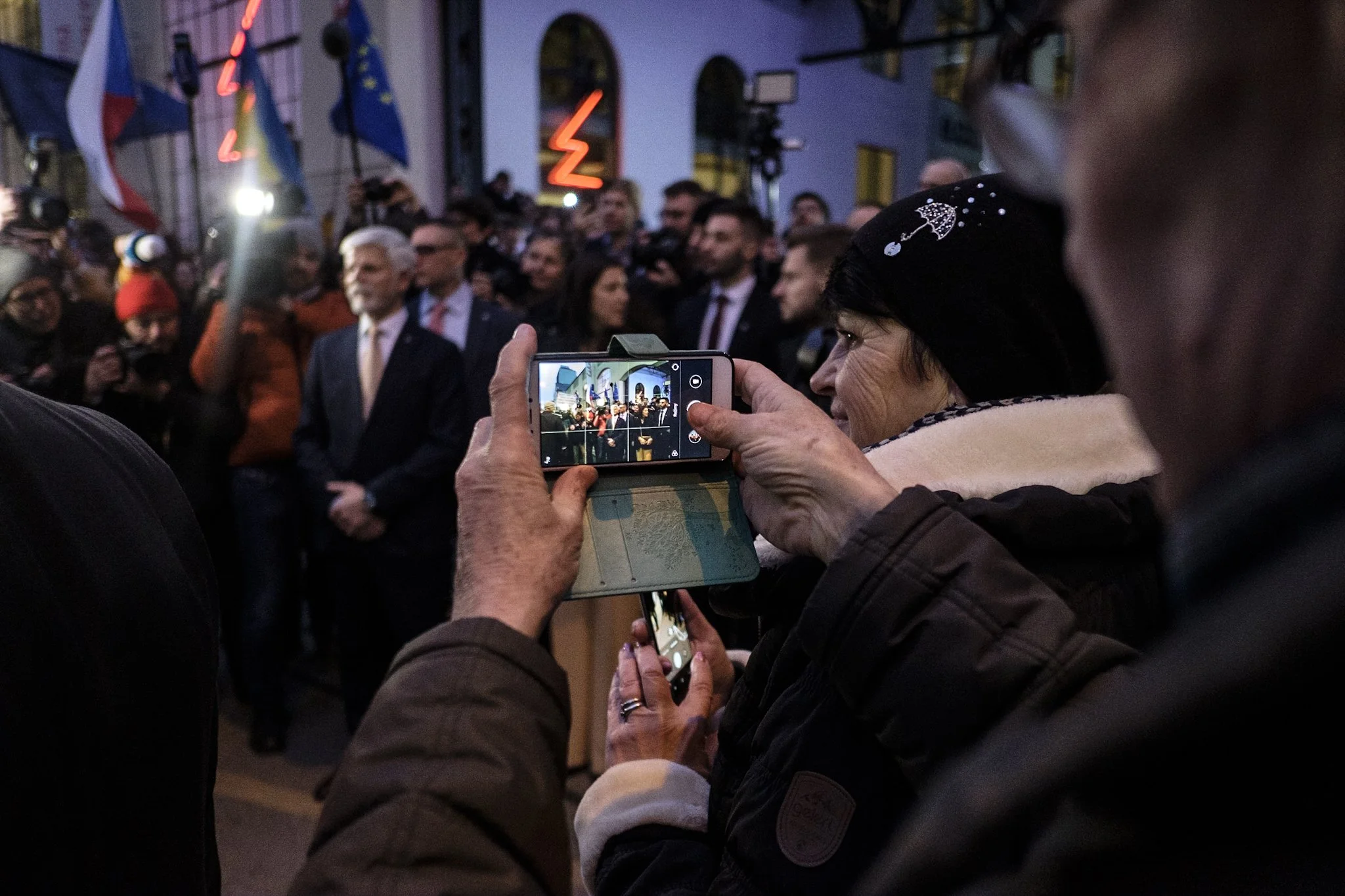
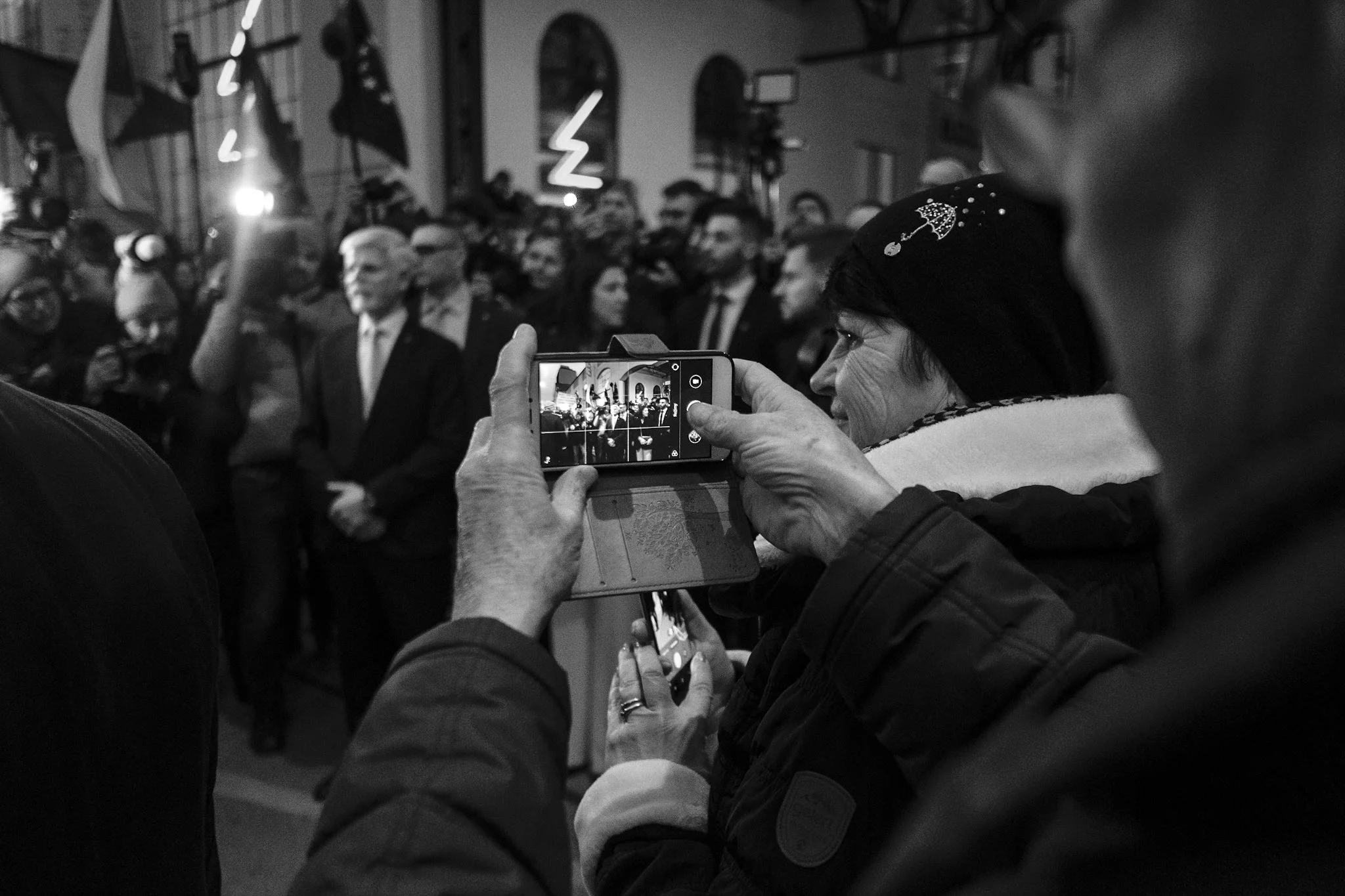
Did I capture it right? Should I ditch the colour? Is the photo losing something in monochrome? These are some of the questions I have been asking myself more and more lately. For example this week I photographed the newly elected Czech president Petr Pavel outside of his campaign headquarters moments after his victory. As always, my cameras were set up to work in Acros+R monochrome mode. But upon importing them into lightroom I saw that they just look better in colour. I can’t quite put a finger on why. It just works better.
Here are the same images in both versions. Let me know if I made the right decision.
I’m not locked in though
Monochrome, or black and white, is still my choice for the final edit for the majority of my work. I just love the way it conveys emotion, the way it does not distract, and the way it makes even unflattering light look good. Golden hour is the best light of the day? Black and white makes even midday harsh sunlight look interesting. I’d even argue that is the best time to shoot in black and white. Is it a gloomy overcast day when the entire sky has turned into one massive softbox eliminating every interesting shadow? Black and white can make even that look dramatic. Black and white does not care about the lighting conditions as much as colour does. You can make it work as long as you concentrate on the right composition and moment.
But as I’ve said, I’m not locked in. I do enjoy the occasional colour click if it makes the image more interesting. It rarely does, but it can occasionally happen.
What about you? Do you photograph in black and white? Do you prefer colour? What are your reasons for doing so?
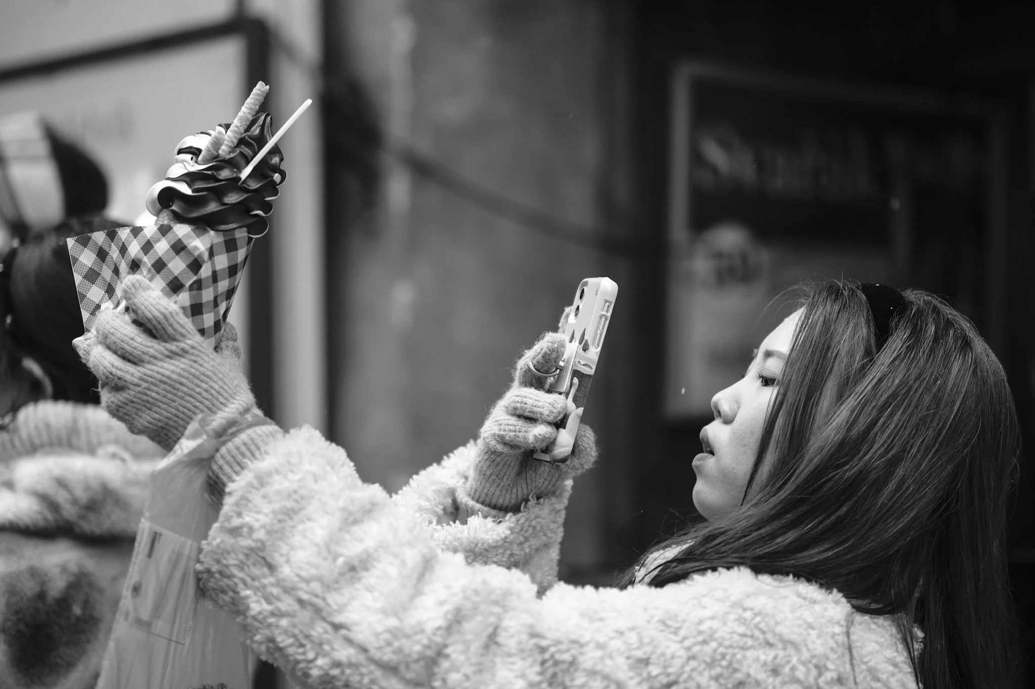
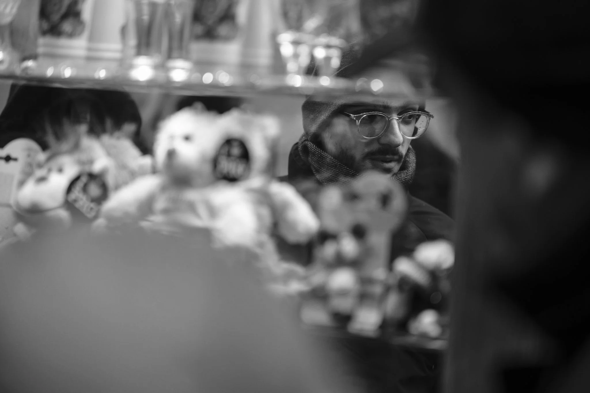
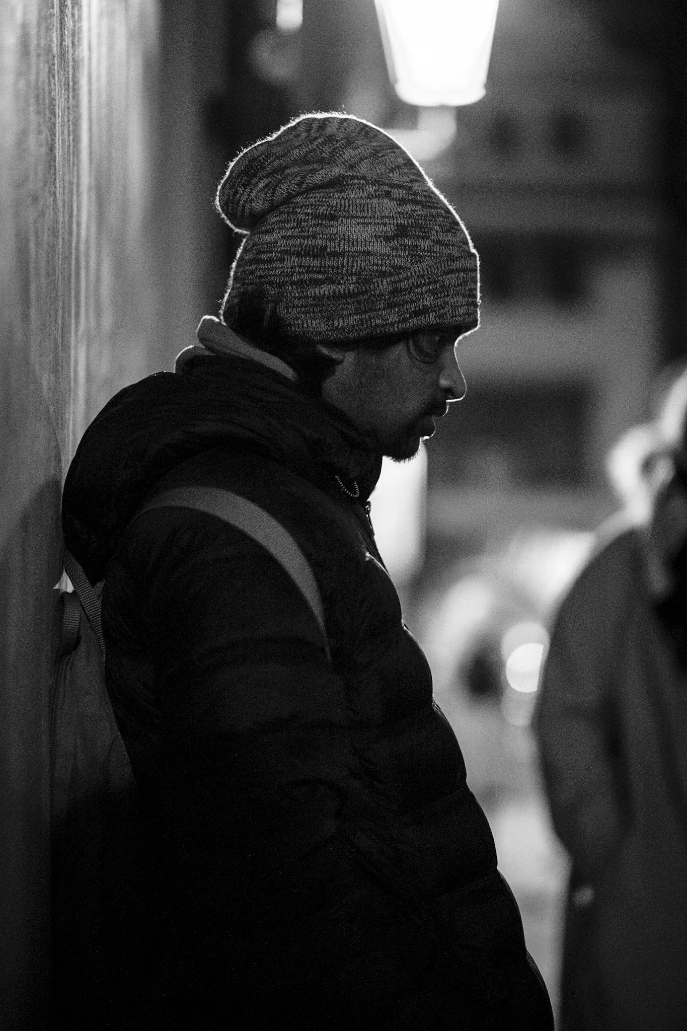
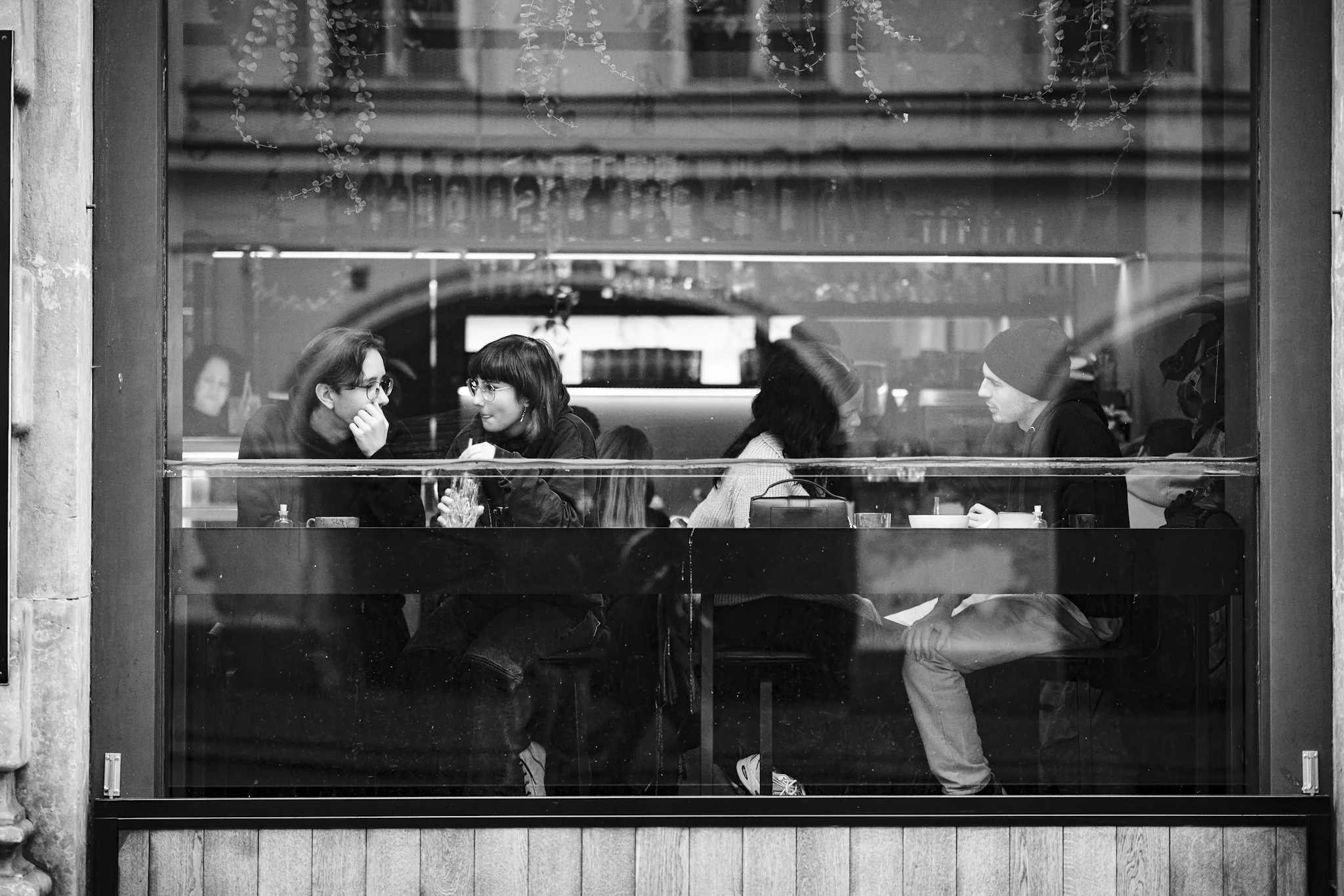
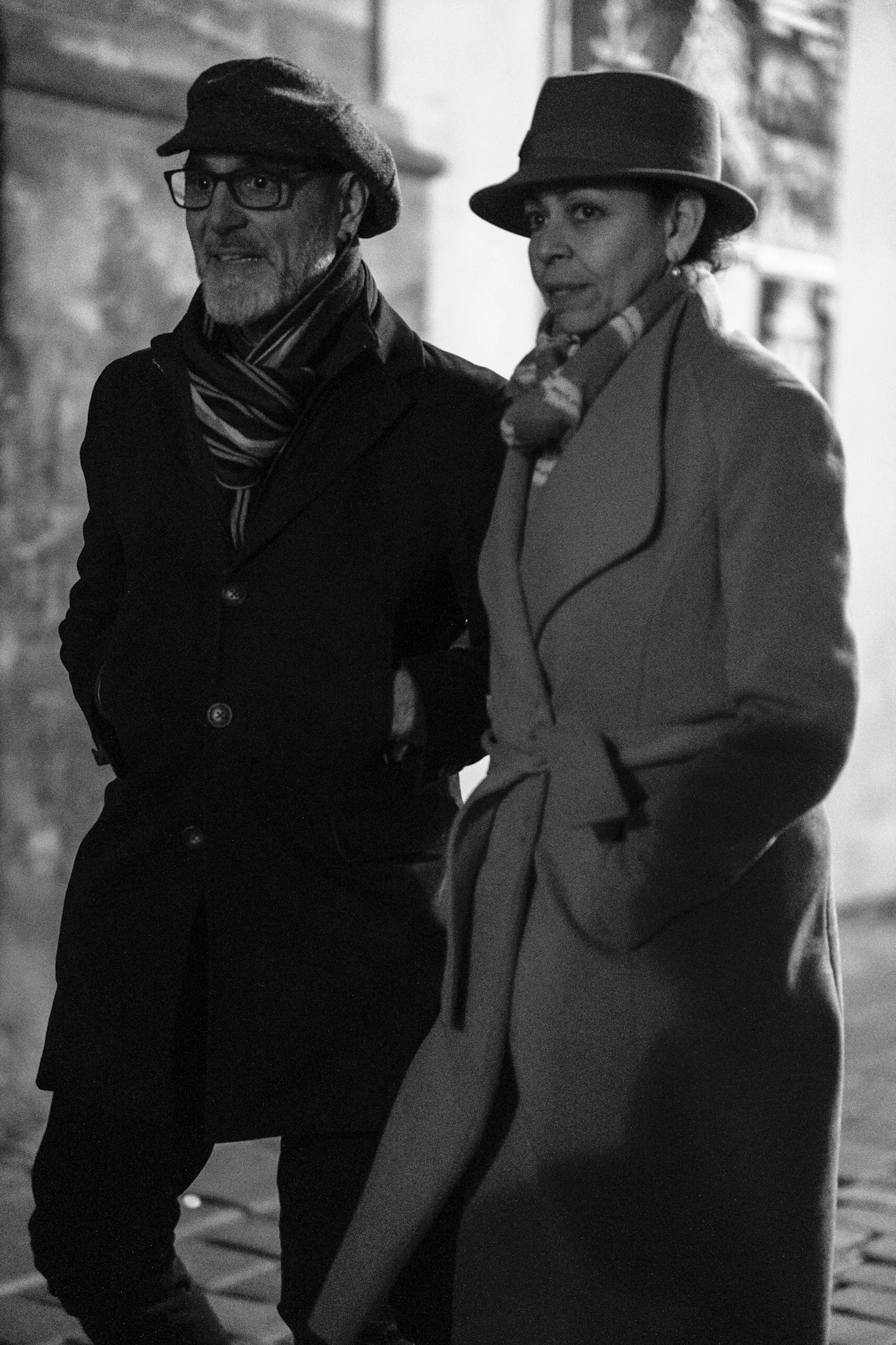
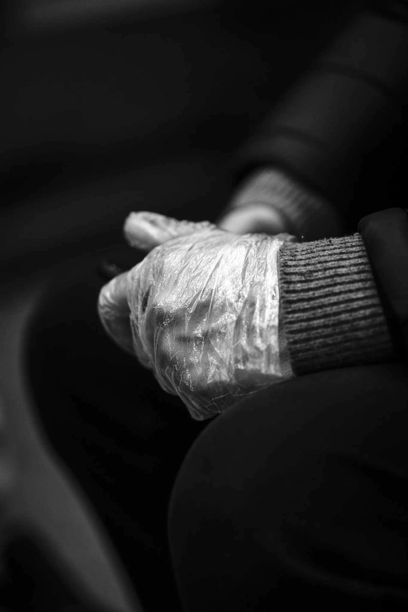
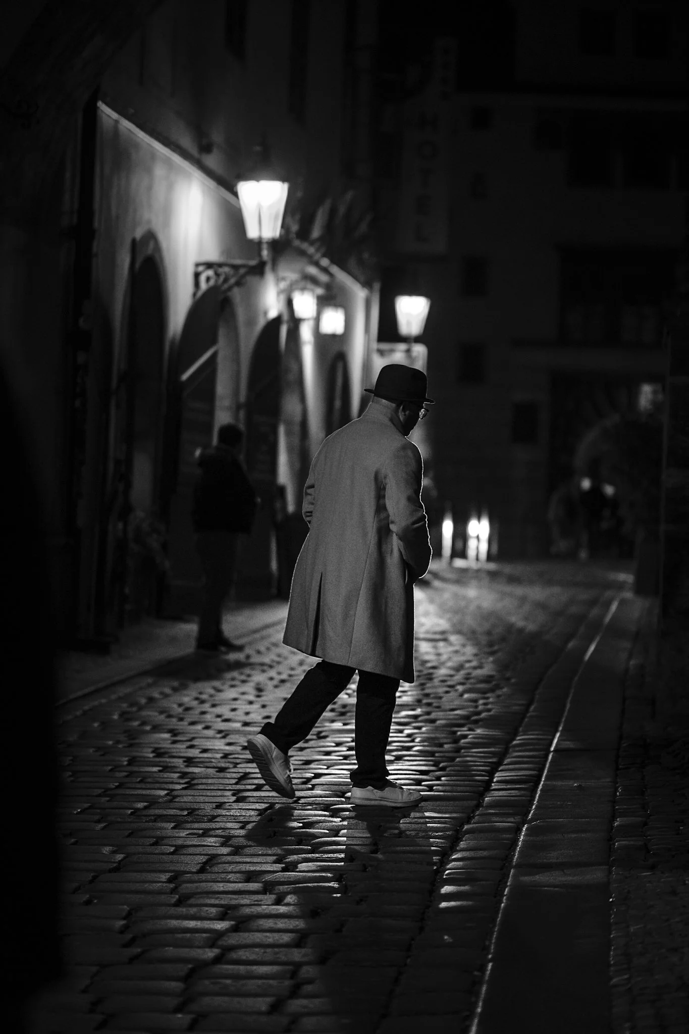
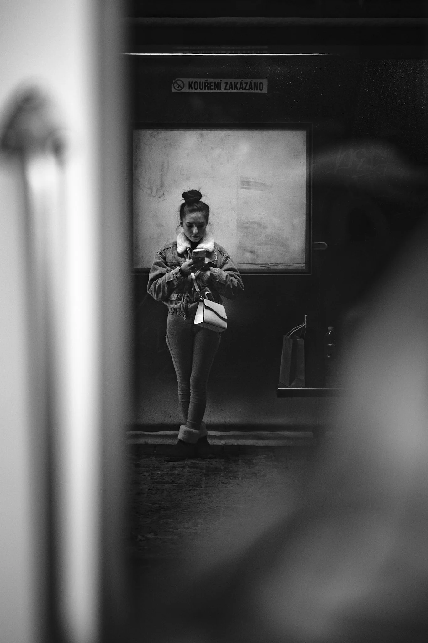
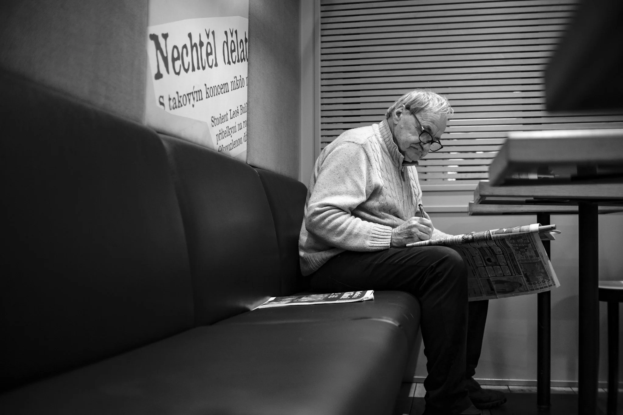
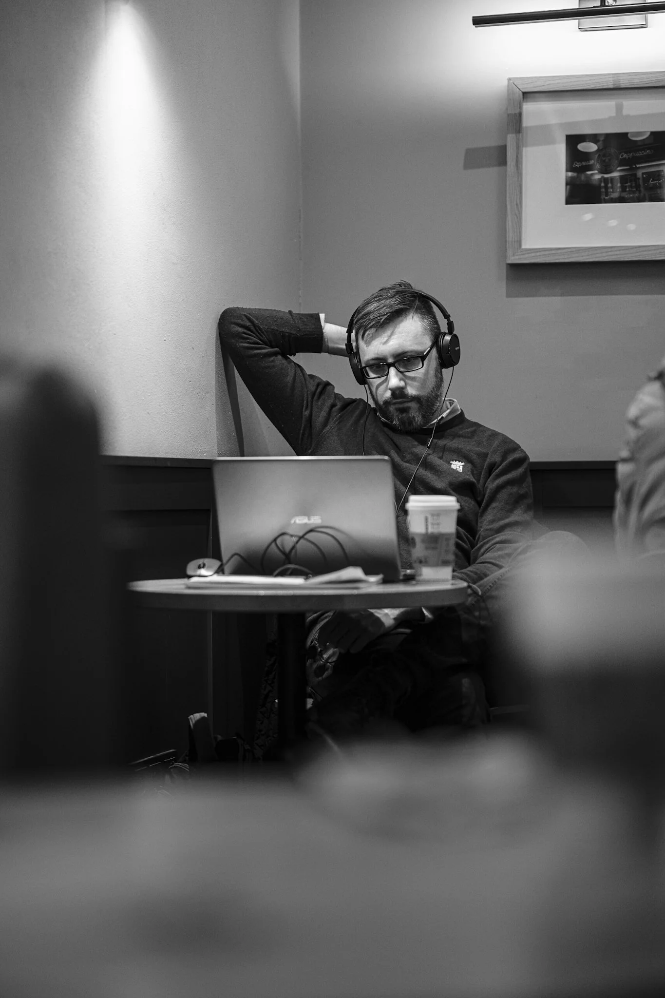
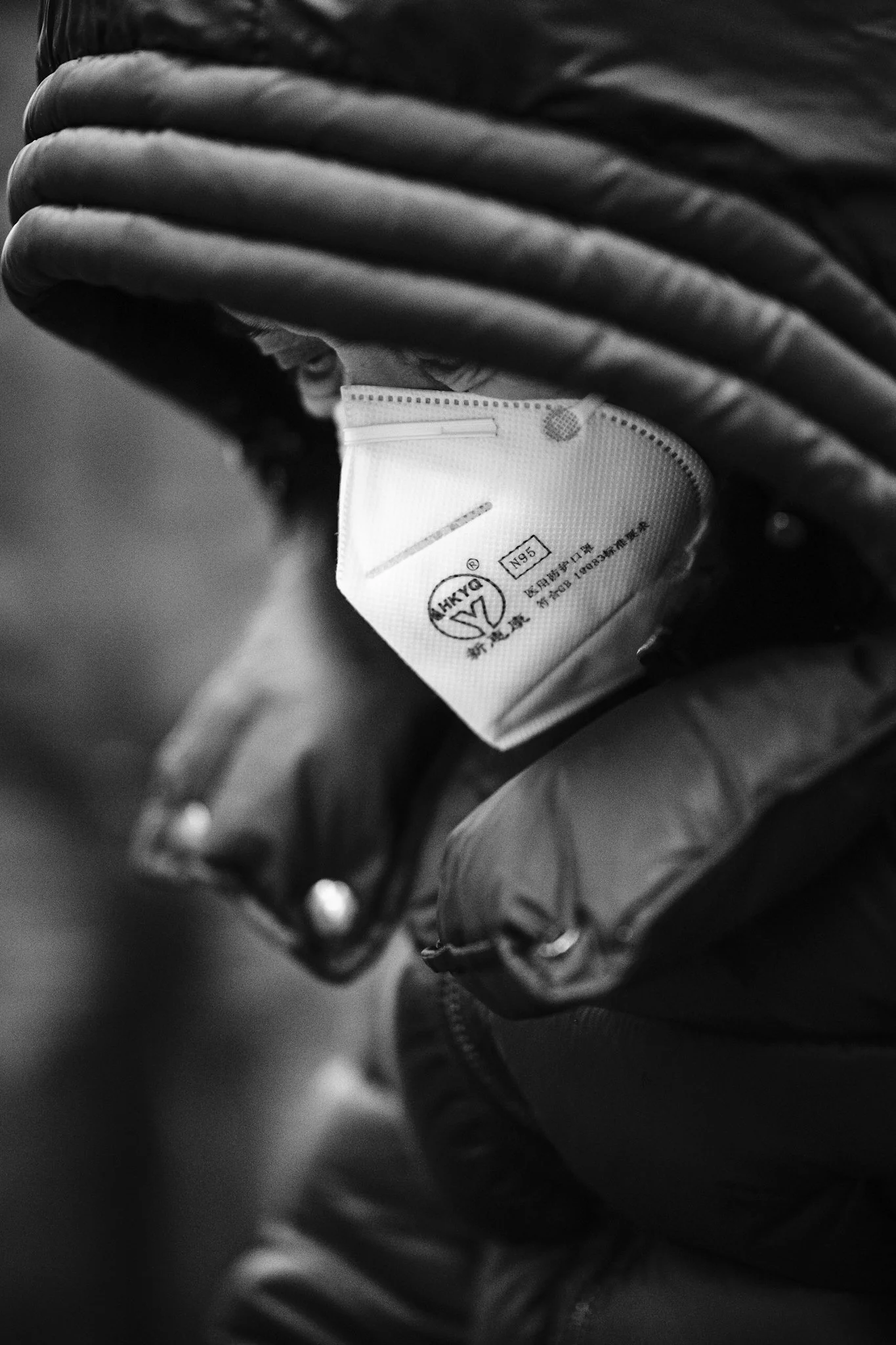
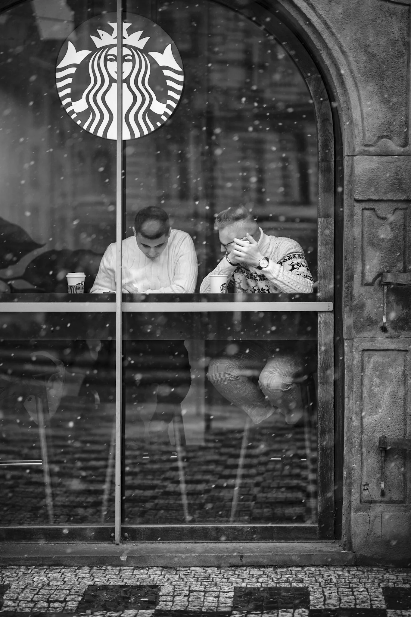
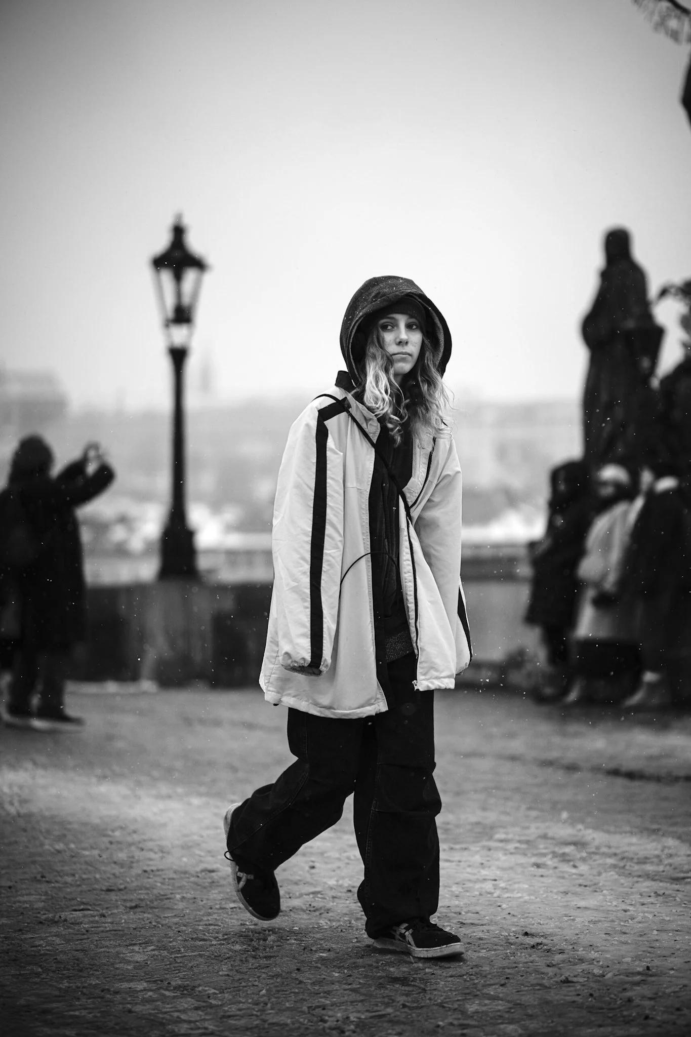
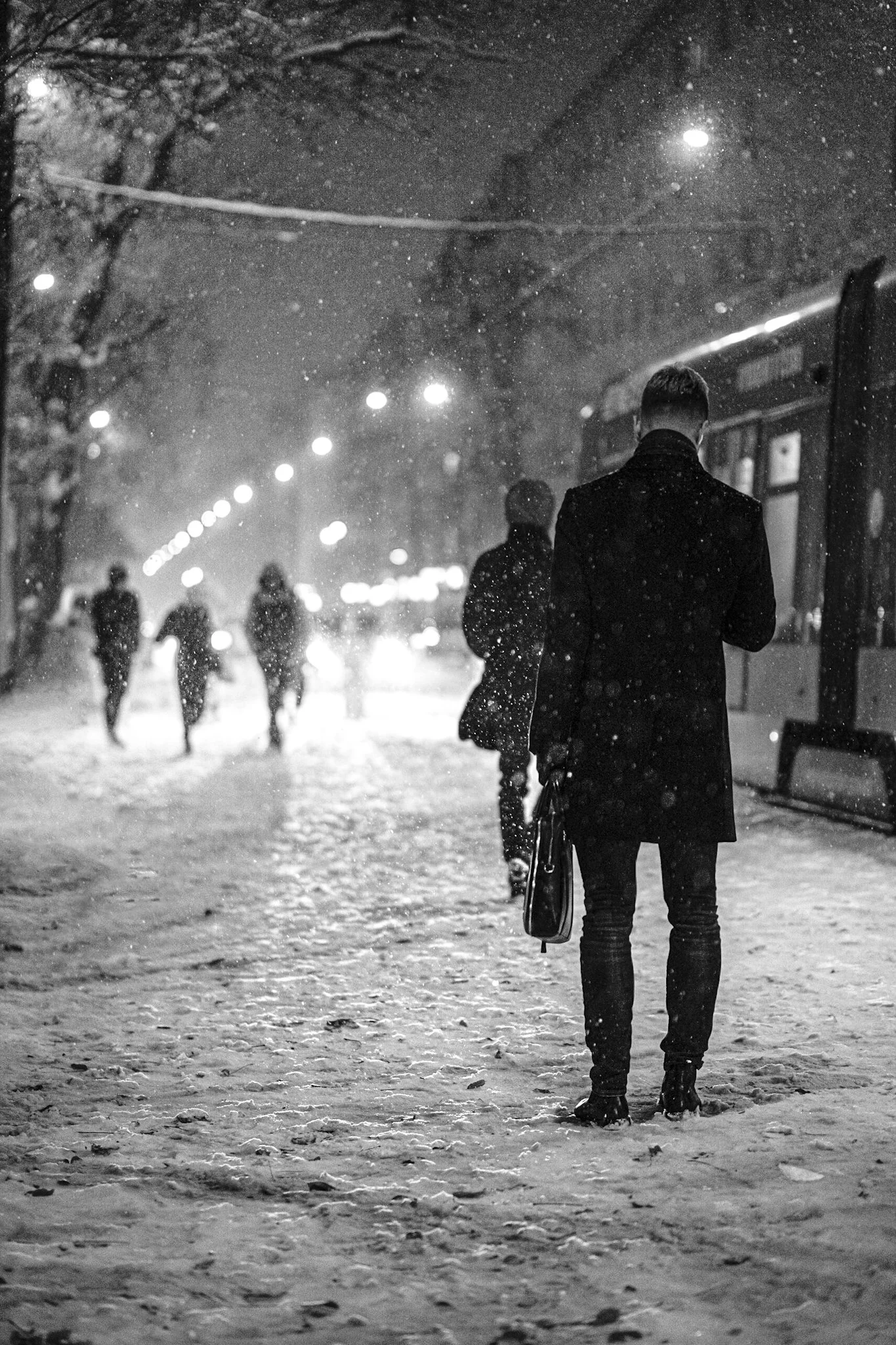
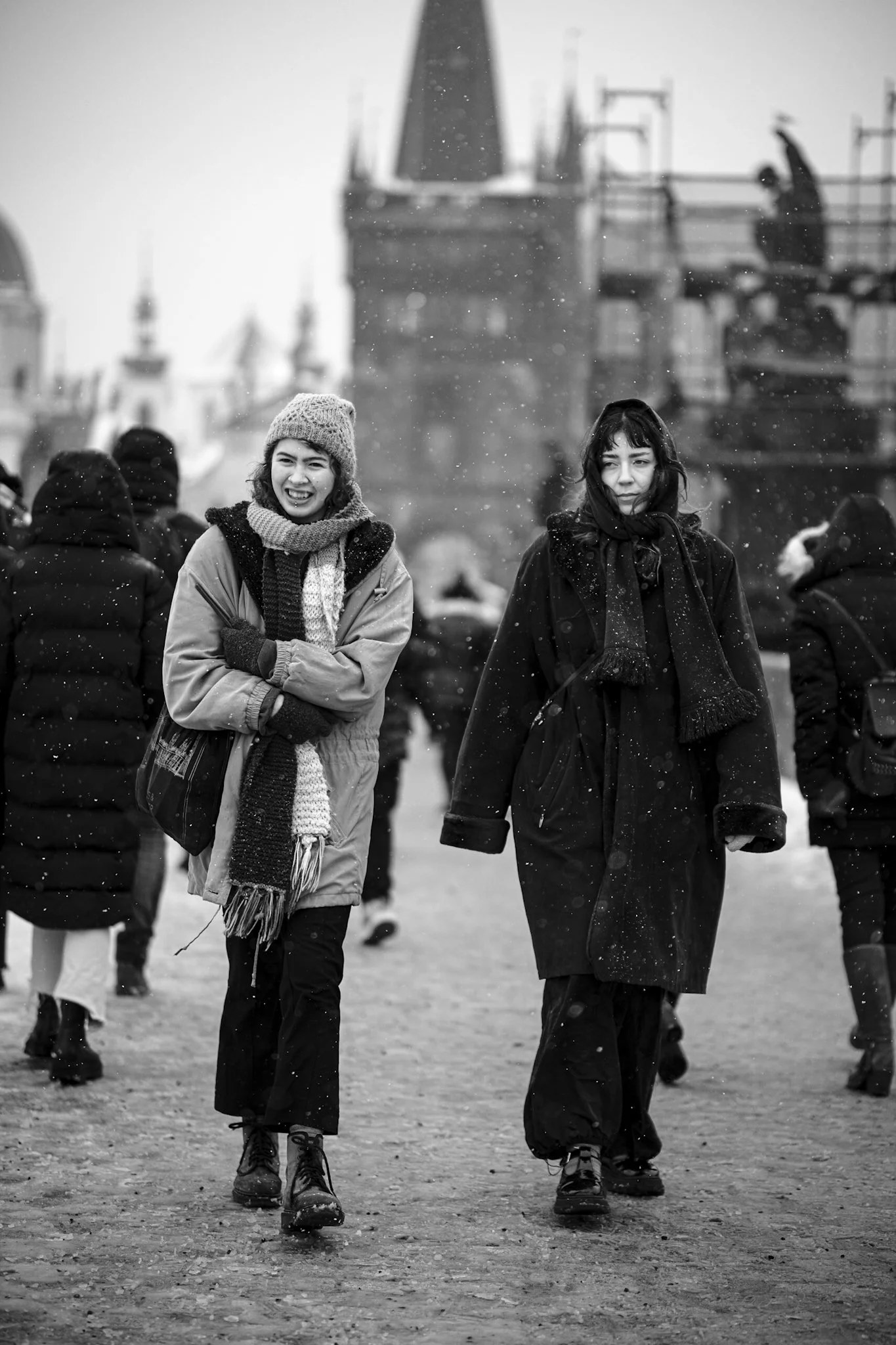
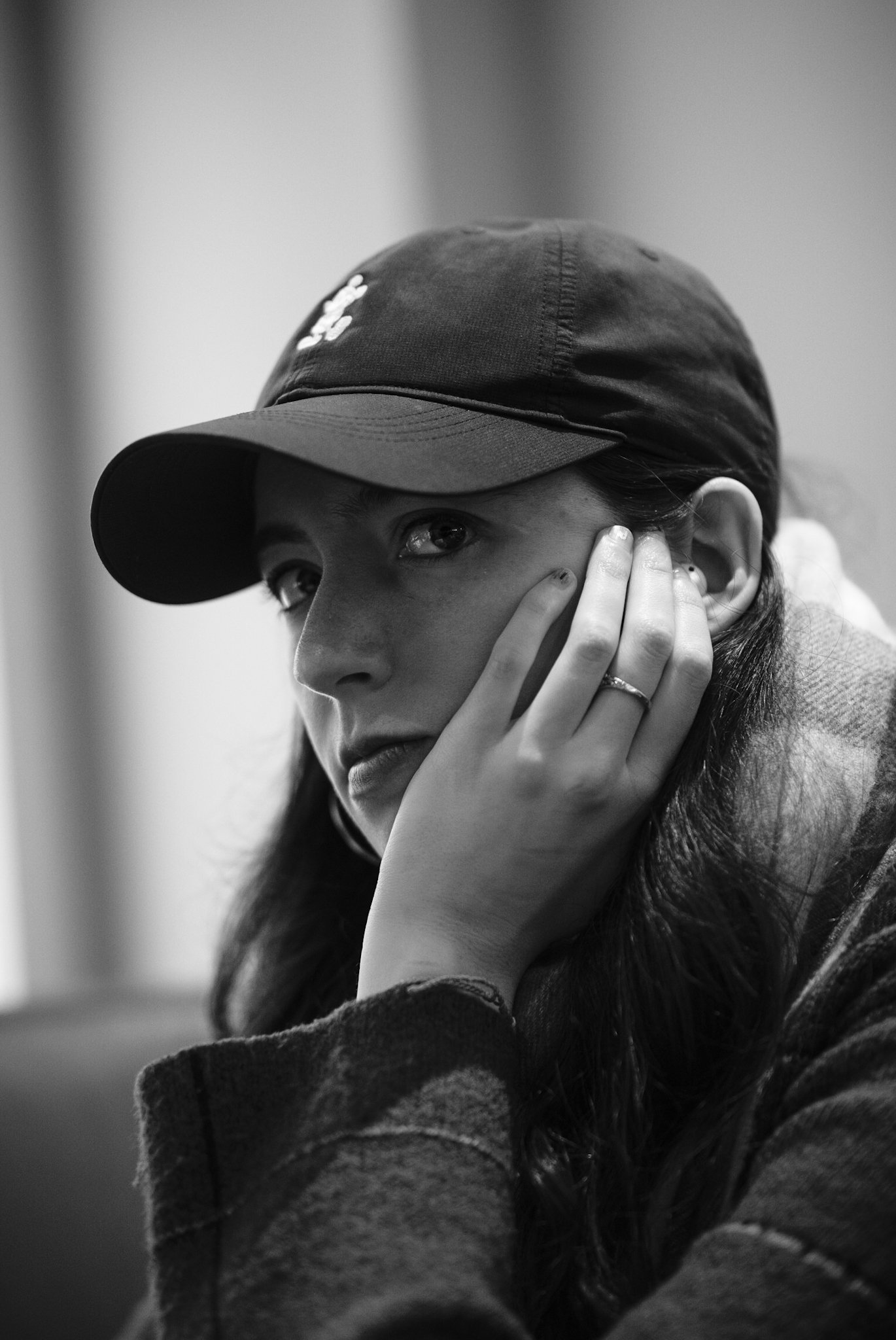
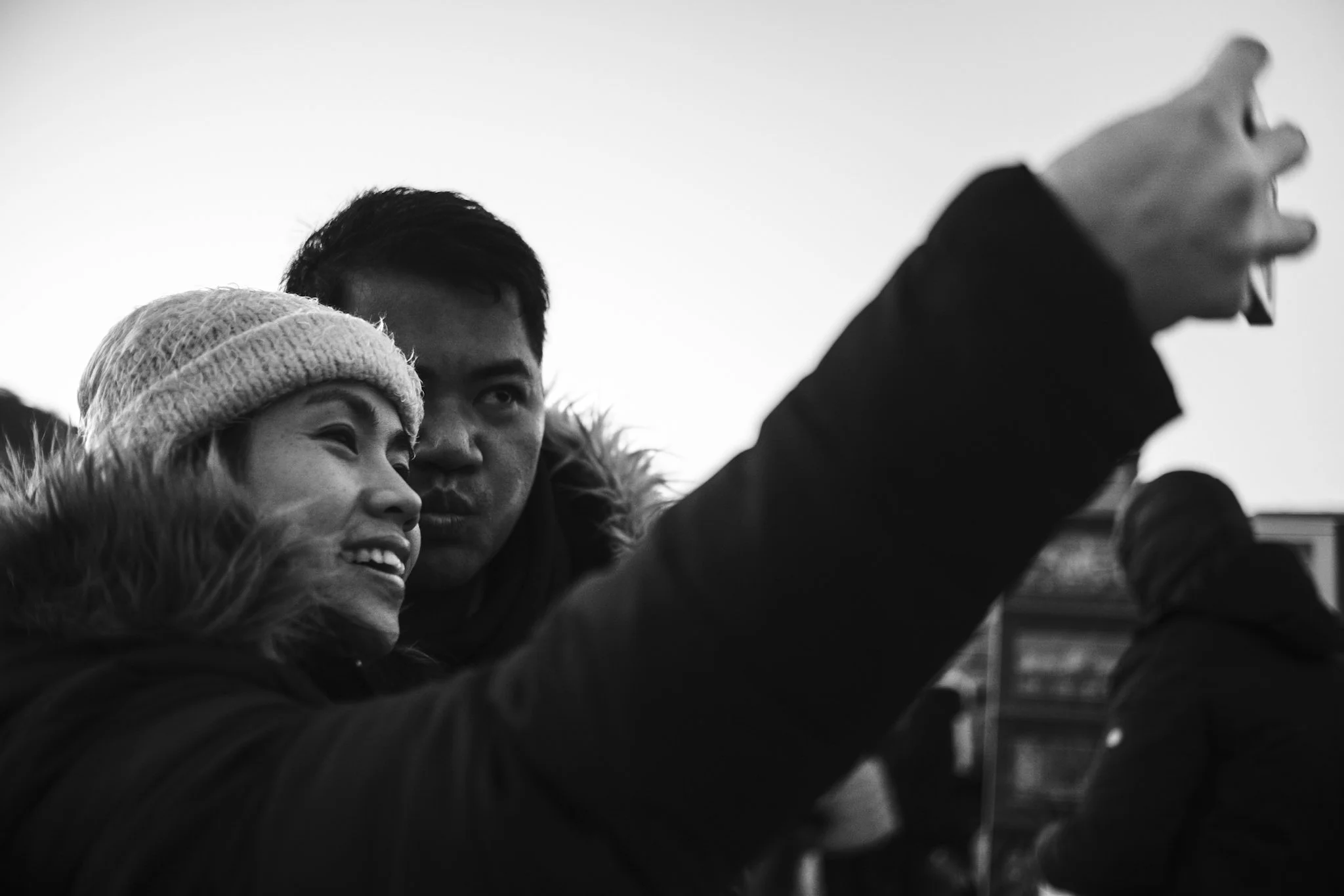
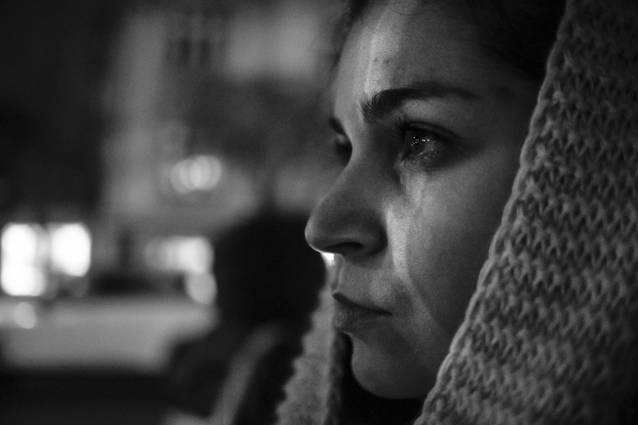
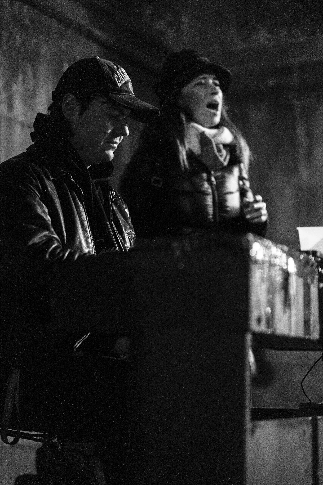
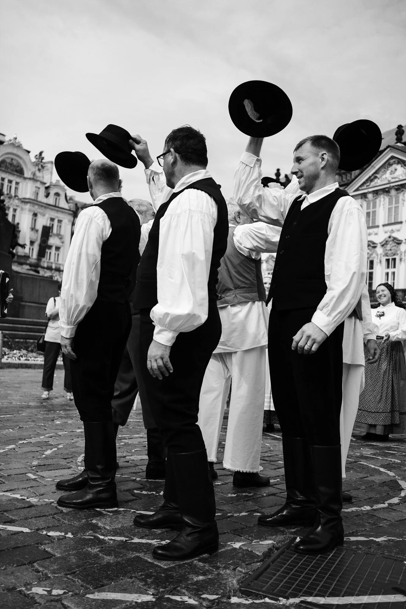
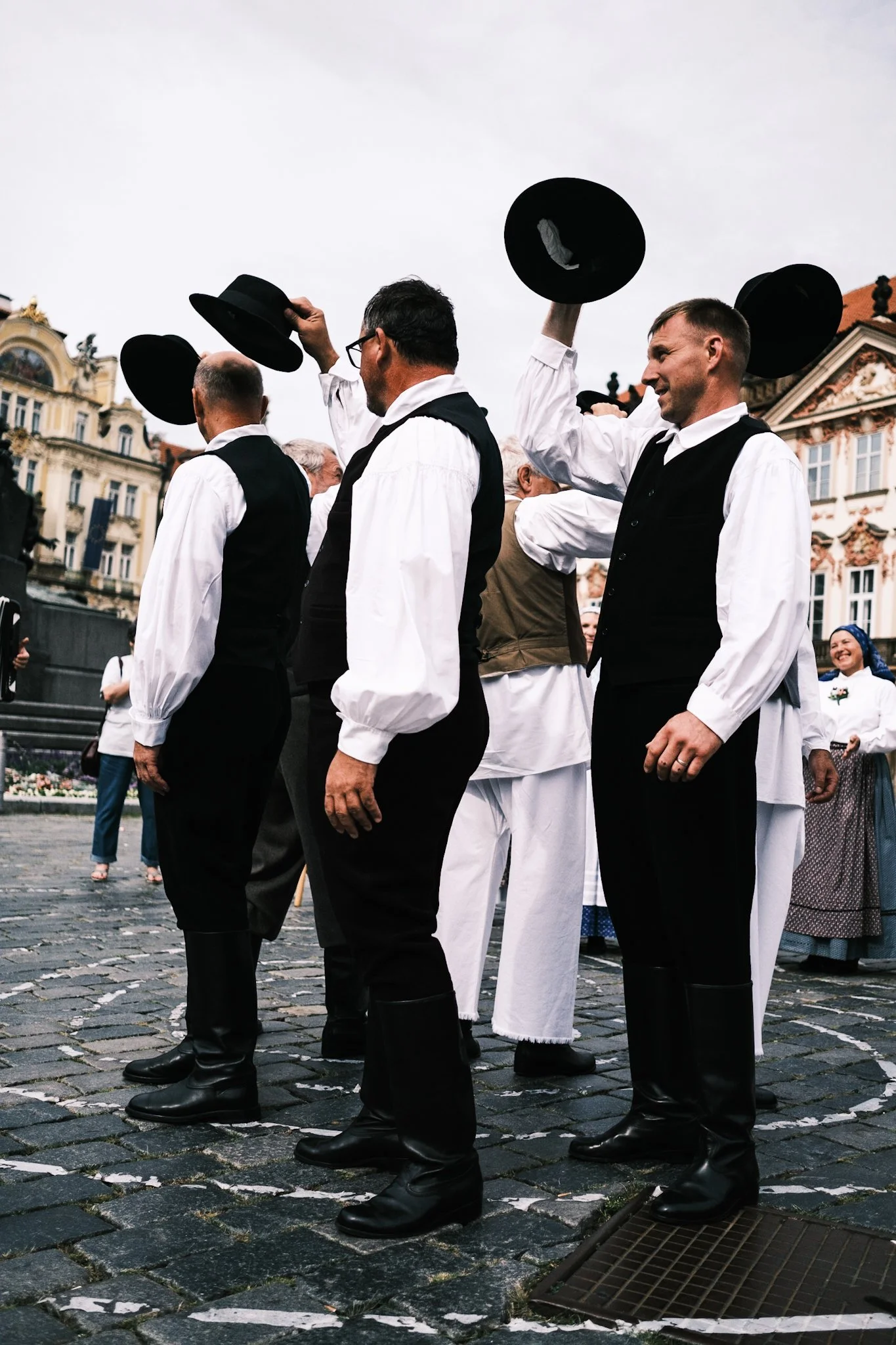
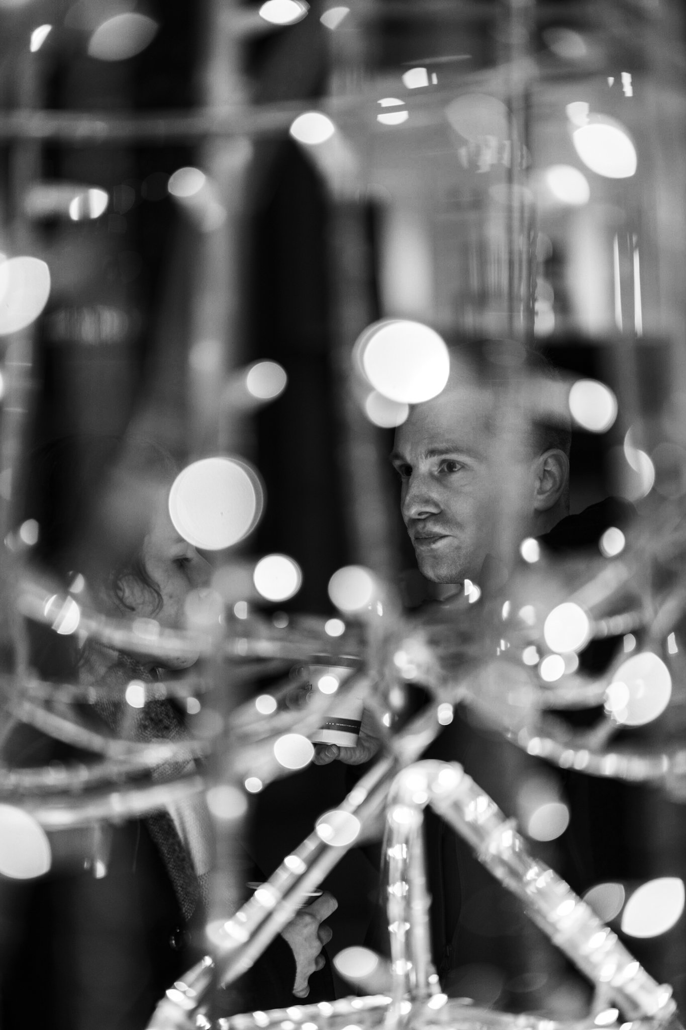
I rarely post any images to my social media nowadays so to make up for that here’s a bunch of images I took recently. Surprise, surprise… They’re in black and white.